Editing Design on the campaign
The "Design" tab in the campaign edit section allows you to customize all the content and graphics on your campaign page.
Accessing the Design Tab:
To begin editing your campaign:
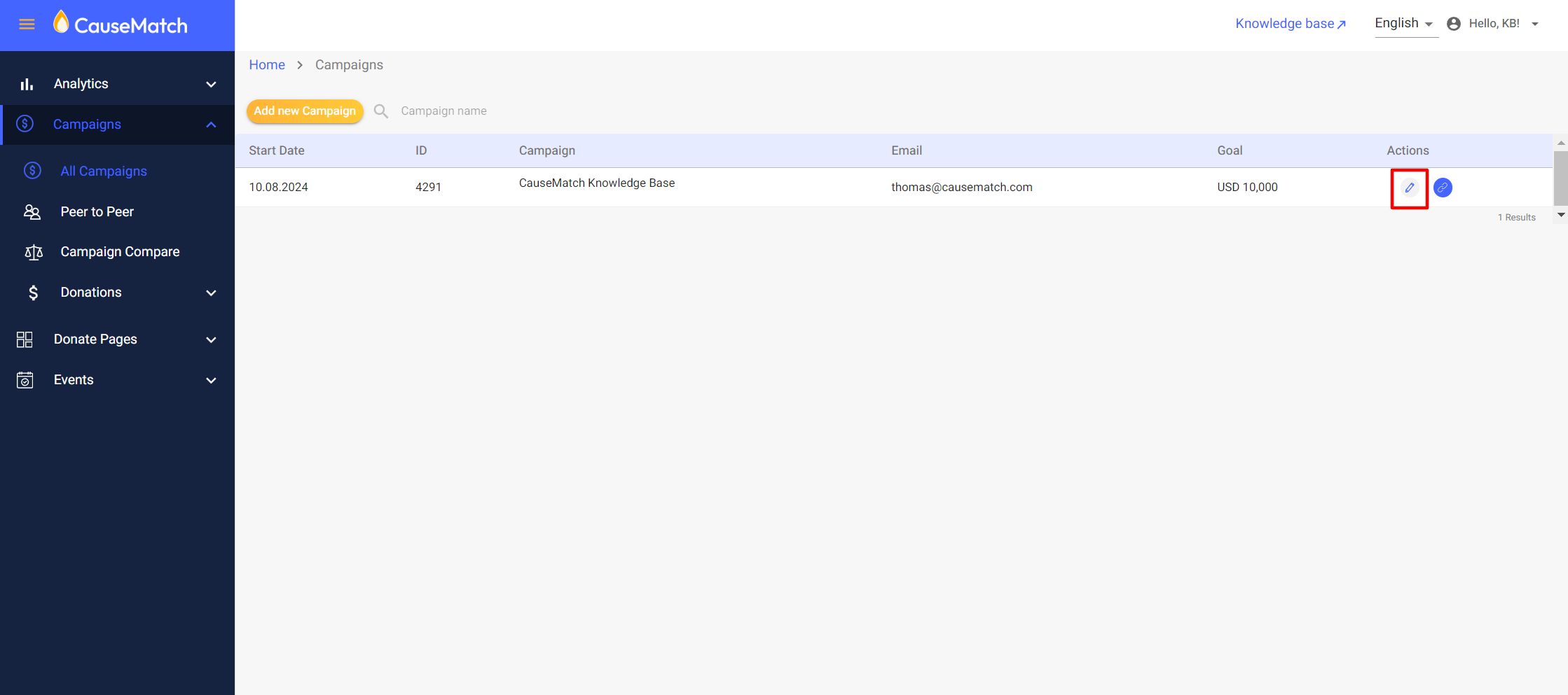
Step 1: Log in to the Dashboard: Once logged in, you’ll see a list of your campaigns.
Step 2: Select Your Campaign: Locate the campaign you wish to edit and click the pencil icon (edit button) next to it. This will take you to the campaign edit section.
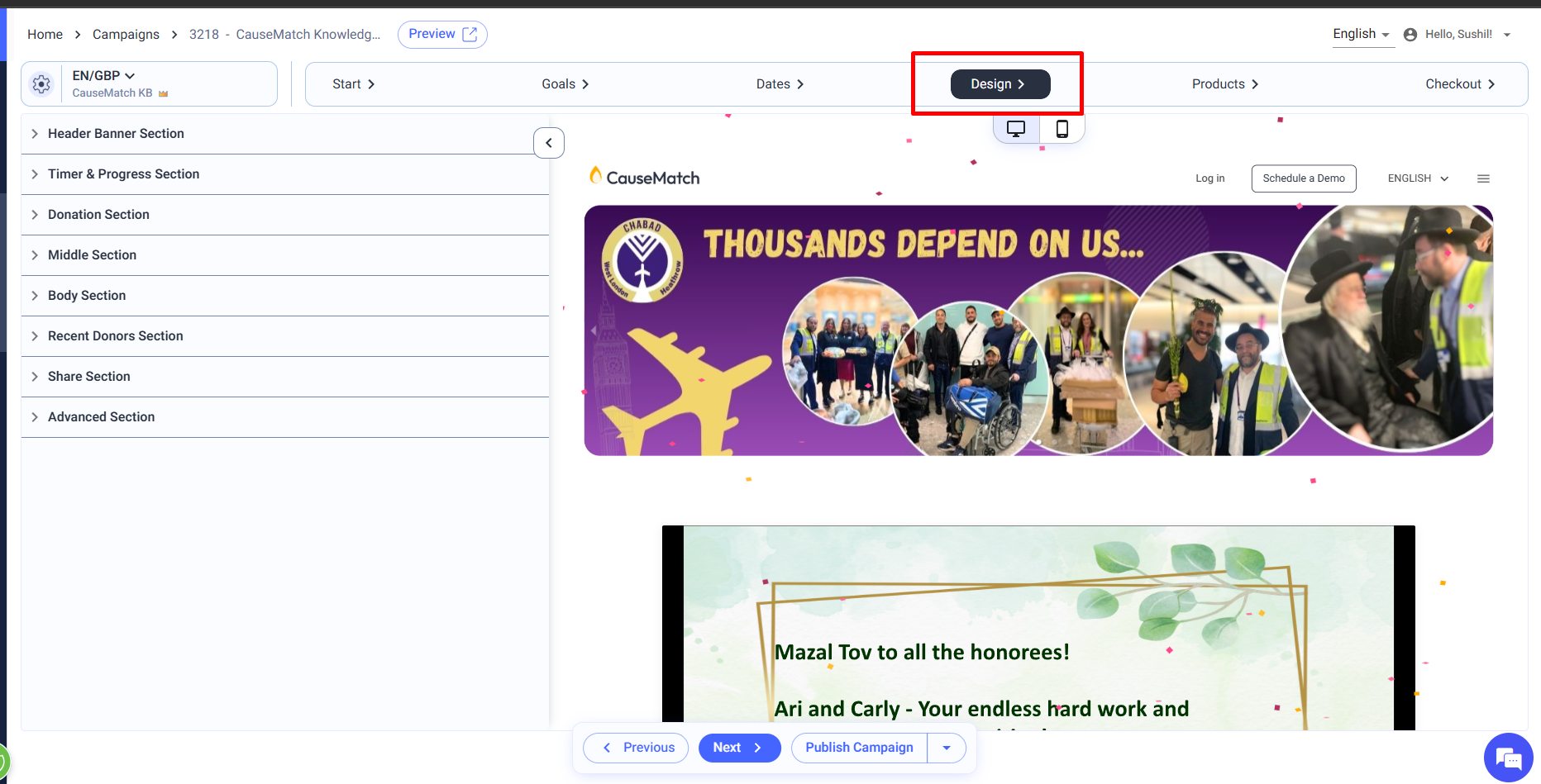
Step 3: Navigate to the Design Tab: The campaign edit section contains multiple tabs. Click on the second tab labeled "Design" to access content and graphics editing tools and, as always please ensure you are editing the correct page if your campaign has multiple pages.
Step 1: Log in to the Dashboard: Once logged in, you’ll see a list of your campaigns.
Step 2: Select Your Campaign: Locate the campaign you wish to edit and click the pencil icon (edit button) next to it. This will take you to the campaign edit section.
Step 3: Navigate to the Design Tab: The campaign edit section contains multiple tabs. Click on the second tab labeled "Design" to access content and graphics editing tools and, as always please ensure you are editing the correct page if your campaign has multiple pages.
Header Banner Section:
The Header Banner is the most prominent visual element on your campaign page. Here’s how you can customize it:
Mobile Version of the Header Banner:
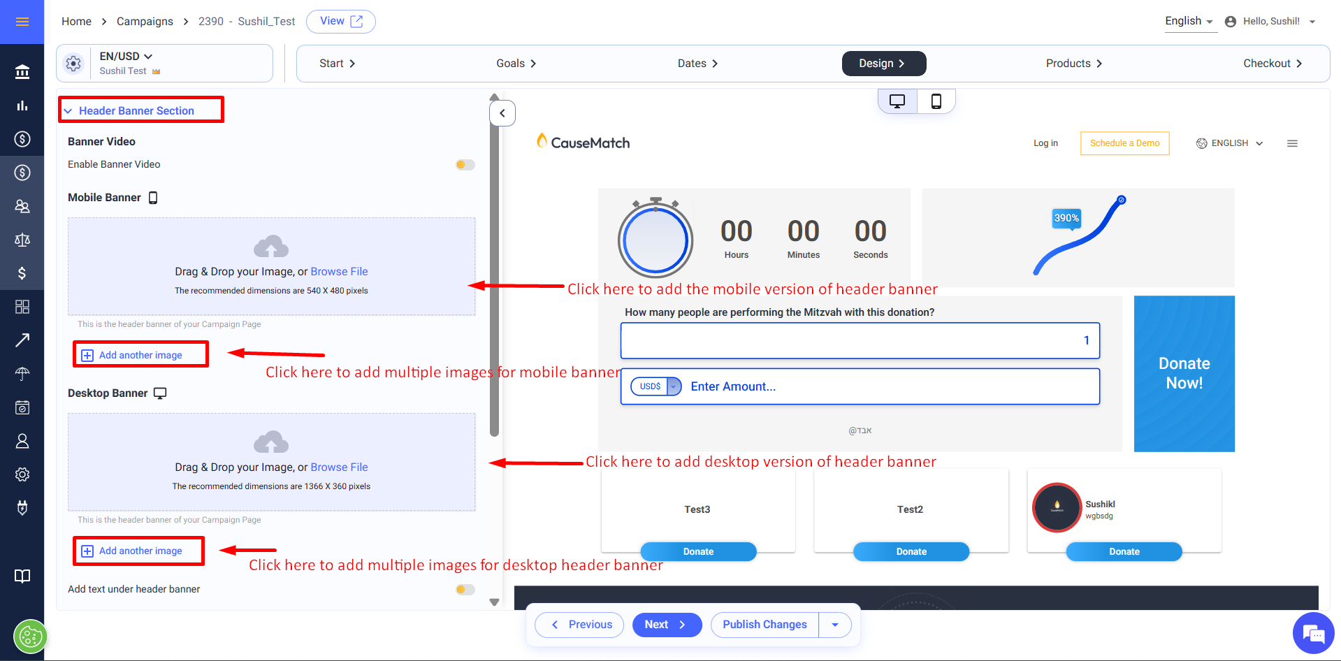
Mobile Banner: In this section, you can upload the main banner image that will be displayed on the mobile version of your campaign page. The recommended image dimensions are 540 x 480 pixels, and it’s advised to keep the file size under 500KB to ensure quick loading times.
Creating a Slider: If you wish to display multiple images in rotation, click on the "+ Add another image" button. This allows you to upload several images, which will cycle through as a slideshow on your campaign page.
Desktop Version of the Header Banner:
Desktop Banner : Beneath the mobile banner options, we have the option to upload the desktop version of the banner. The recommended dimensions for desktop images are 1366 x 360 pixels, with a maximum file size of 500KB.
Creating a Slider: Just like the mobile version, you can add multiple images for the desktop banner by clicking on "+ Add another image" button.

The Mandatory Graphics to launch include:
Main Banner/Cover Image* (1366*360px/500KB)
Main Mobile Banner* (540*480px/500KB)
Social Media Image (720*390px/300KB)
High Res. Logo (180*180px/100kb)
Optional Graphics include:
Body Banner (1366px* custom height px/500KB)
Mobile Body Banner (540px* custom height px/500KB)
Checkout Banner (1366*360px/500KB)
Checkout Mobile Banner* (540*480px/500KB)
with best practices for fundraising.
Video Integration in the Header Banner:
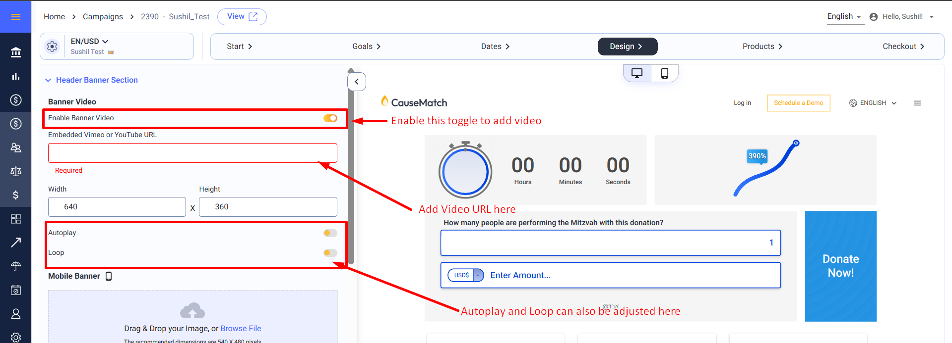
Adding a Video: If you wish to include a video in your header banner, use the "Enable Banner Video" toggle. Once enabled, paste the video URL into the designated field. Please note that only Vimeo and YouTube links are supported, and they must be in the following formats:
YouTube: https://www.youtube.com/watch?v=XHN47JbGjnk
Vimeo: https://vimeo.com/786239300
Auto play and Loop Options: Additionally, you can enable the video to auto play or loop by toggling the corresponding options.
Adding Text Under the Header Banner:
Enable the Text Field: Below the header banner section, there is an option to add text. To do this, enable the "Add text under the header banner" toggle. The text you add here will appear immediately below the header image. A graphical representation on the right side of the screen in the "Design" tab will show you where this text will be displayed.
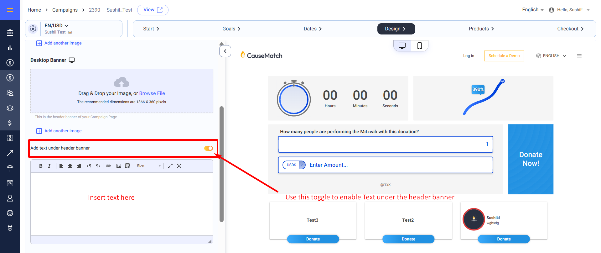
Enable the Text Field: Below the header banner section, there is an option to add text. To do this, enable the "Add text under the header banner" toggle. The text you add here will appear immediately below the header image. A graphical representation on the right side of the screen in the "Design" tab will show you where this text will be displayed.
Timer & Progress Section:
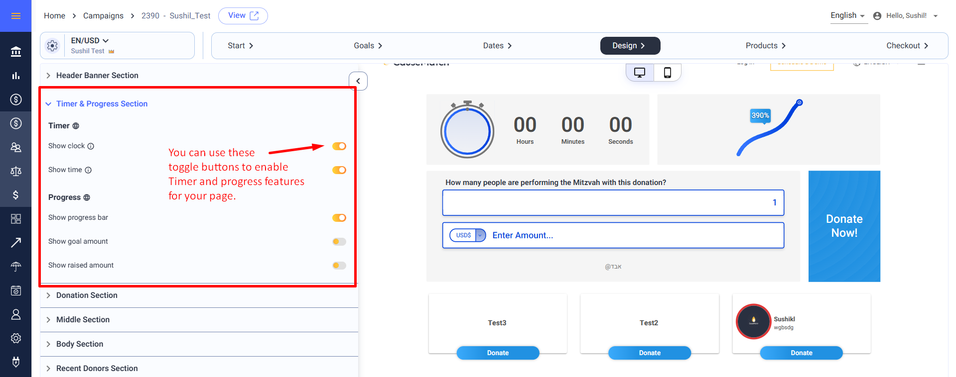
Timer: The clock and timer can be enabled or disabled on the campaign page by switching the toggles.
Show Clock: If enabled, it displays the clock on the campaign page. If disabled, the clock will not be shown.
Show Time: When enabled, it displays the countdown timer on the page. If disabled, the timer will not be shown.
Progress:
Show Progress Bar: If enabled, it displays the progress bar on the page. If disabled, the progress bar will not be shown.
Show Goal Amount: When enabled, it displays the goal amount on the page. If disabled, the goal amount will not be shown.
Show Raised Amount: If enabled, it displays the amount raised on the page. If disabled, the raised amount will not be shown. Each option can be enabled or disabled on the campaign page by switching the toggles.
Donation Section:
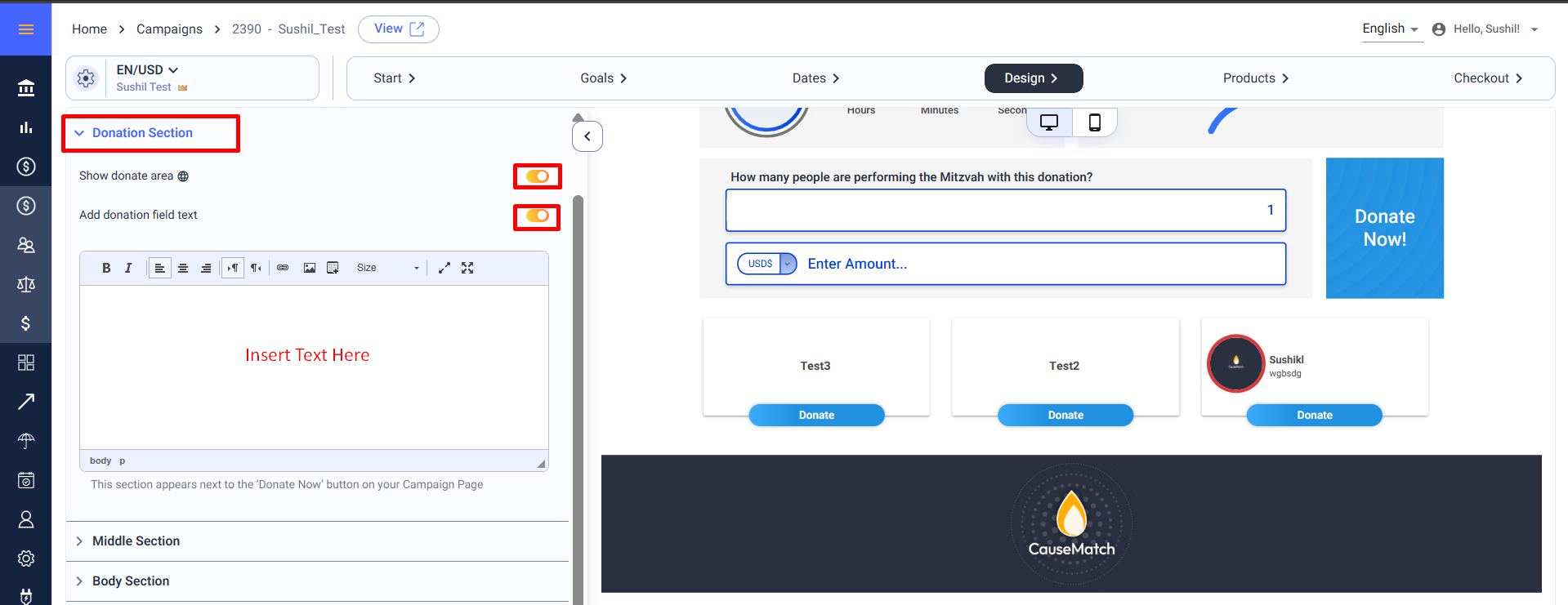
Show donate area: Enabling this option will display the donation section on the campaign page. If you prefer not to show the donation section, disabling the toggle will hide all elements including the currency selection, amount entry, donate button, and field text.
Add donation filed text: This option allows you to add a message or call to action right next to the "Donate Now" button. To do so, enable the "Add donation field text" toggle. A graphical representation on the right side of the screen will show where this text will be placed.
Add donation filed text: This option allows you to add a message or call to action right next to the "Donate Now" button. To do so, enable the "Add donation field text" toggle. A graphical representation on the right side of the screen will show where this text will be placed.
Middle Section:
Text in the middle of the page: You can add additional content in the middle of the campaign page, specifically below the donation area. This is useful for adding more detailed information or a personal message. To add content here, enable the "Add text in the middle of the page" toggle. The right side of the "Design" tab will show you where this content will appear.
Body Section:
The body banner is another key visual element on your campaign page, located right above the recent donors section. Here’s how to customize it:
Adding Text above the Body Banner:
Adding Text above the Body Banner:
Enable the Text Field: If you want to include text above the body banner, enable the "Add text above the body banner" toggle. This allows you to provide additional context or information directly above the
banner image.
Mobile Version of the Body Banner:
Image Upload: For mobile users, you can upload a mobile-optimized body banner. The recommended dimensions are 540 x 480 pixels. The ideal file size is under 500KB.
Desktop Version of the Body Banner:
Desktop Image Upload: You can upload the desktop version of the body banner here. The recommended dimensions for desktop images are 1366 x 200 pixels and the recommended file size is 500 KB.
Adding Text Under the Body Banner:
Enable the Text Field: If you want to include text beneath the body banner, enable the "Add text under the body banner" toggle. This allows you to provide additional context or information directly below the banner image.
Recent Donors Section:
Show recent donors section: The "recent donors section" shows the list of recent donors, ambassadors, and the campaign’s "about" section. Disabling this option hides the entire section.
Default tab: You can choose your default open tab from the panel for Donors, About, Ambassadors etc.
Organization logo: Your organization’s logo is an important branding element for your campaign. You can upload the logo here, with the recommended dimensions being 160 x 160 pixels.
Default tab: You can choose your default open tab from the panel for Donors, About, Ambassadors etc.
Organization logo: Your organization’s logo is an important branding element for your campaign. You can upload the logo here, with the recommended dimensions being 160 x 160 pixels.
About campaign: This section is dedicated to your campaign’s story and mission. The content you add here will appear in the "About The Campaign" tab on your campaign page. The "Design" tab provides a graphical representation showing where this information will be displayed.

The "About The Campaign" section will remain hidden on the page unless content is added.
Share Section:
Show Share Buttons: Enabling this toggle will display the share buttons on the campaign page. If you prefer not to show the share buttons, disabling will hide them.
Social Media Image: The image you upload in this section will be displayed whenever your campaign link is shared on social media platforms. The recommended image dimensions are 720 x 390 pixels, and the file size should be less than 300KB to ensure optimal display across various platforms.
Saving and Previewing Changes
Save as Draft: After making all your edits, it’s crucial to save your changes to ensure they reflect on your campaign page.
Preview: To see how your changes will appear live, use the "Preview" button located on the right side of the screen. This feature allows you to review your campaign’s design and content before it goes public.
Previous & Next: You can navigate to the previous Start tab or the next Dates tab by clicking on these options.
Send to Review: You can send the campaign for review after you are done with your changes, out team will look over the page and update further.
Need Assistance?
If you encounter any issues or have questions, our support team is here to help. You can reach us through live chat or by emailing support@causematch.com. We are always happy to assist you with any aspect of your campaign.
Related Articles
Editing your campaign goal
To begin editing your campaign goal: Step 1: Log in to the Dashboard Once logged in, you’ll see a list of your campaigns. Step 2: Select Your Campaign Locate the campaign you wish to edit and click the pencil icon (edit button). This will take you to ...Editing Start and Advanced Settings tab of the campaign
The Start tab allows you to customize the key aspects of your campaign. On this tab, you can access and modify the basic and advanced settings of your campaign. Accessing the Start Tab To begin editing your campaign: Log in to the Dashboard: Once ...Editing Advanced Settings of the campaign
Advanced settings are additional configuration options that allow you to fine-tune various aspects of your campaign beyond the basic settings. Advanced settings can be accessed by clicking the gear icon next to the language and currency dropdown. ...How to Create and Manage a Campaign Page
Getting Started Log in to your account using your username and password or with the Sign in with Google option. To create a new campaign, click the "Add New Campaign" button on your dashboard. To edit an existing campaign, locate the campaign and ...How to Edit the “About Campaign” Section of Your Campaign Page
1. Log in to your account using your username and password, or sign in with Google. 2. Select the campaign you want to edit and click the edit button. 3. Navigate to the Design section, then click on the Recent Donors section. Scroll down to locate ...